Recreating the ripple click effect from Google material design
Description
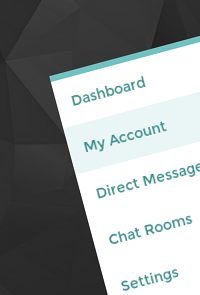
Recently Google released its material design spec which showcases some very cool user interactions. One of them is the ripple click effect where an ink-drop like element moves out radially from the position where the user taps/clicks. This effect has also been integrated in the paper elements collection in the Polymer Project by Google. This walkthrough creates the same effect using jQuery, CSS3 and simple HTML elements instead of web components.
The logic here is to create circles at click coordinates behind the links with the parent item using overflow: hidden; to contain the ink element. The circles are initially scaled down to 0% and then animated to 250% to cover the entire parent element. As the circles increase in size their opacity starts to decrease.
21 Comments
Description


21 Comments
(close)Tigo
As always – very nice!!! (y)
Rodrigo
Nice!!
Muyassir
That’s Great..
keep up your efforts..
Angus
does not work when copied to codepen or jsfiddle
somonflex
You should add this on your css:
.ink
{
border-radius: 10000px; /* Android 2.3 hack */
opacity: 0; /* Android hack */
}
Angus -> You must add vendor prefix on your code for transform, animation and keyframes (-webkit-transform, -webkit-animation, @-webkit-keyframes…)
Leon
Really nice effect, and simple implementation. Though, if you watch the text in the left hand area here in Chrome, it adjusts font-weight during the animation. If you add translateZ(0) to the parent li’s, or the ul, it’ll prevent this from happening.
steve
does not work with html 5
Jeevan
Really this site and idea to develop this site was amazing
i am amazed when i saw this web site
this is verry helpfull to all
Norm
No keyboard access, not accessible; neat demo that could be better!
Ravindu
my tried this code but it’s not working.. i don’t know why… :( can u help me?
Mahdouch
hey admin, when i copy this code to m pc it does’nt work i dont knw why !!!
peter
Unfortunately it doesn’t work when I plug it into my text editor
Gabor
Here is a simplier and working version folks:
http://www.jqueryscript.net/animation/jQuery-Plugin-To-Create-Customizable-Ripple-Click-Effects.html
[email protected]
just add vendor prefix
it’s amazing
andr
So awesome and so simple! Thank you (:
Gabriel
It is not working, even with the vendor prefix. I mean, the animation blinks, but it starts and disappear, it is not smoothly as in the demo>>
pankaj
appriciate your job.grt explanation.like it..
Kryometric
How do you add this to your website?
MattiLeBlanc
Thanks, this example did get me on my way. However, I have a big improvement I want to share (assuming you use jquery):
$( ‘.paper-button’ )
.on( ‘click’, function( e )
{
$this = $(this);
// create .ink element if it doesn’t exist
//
if ( $this.find( ‘.ink’ ).length === 0 )
{
$this.prepend( ” );
}
ink = $this.find( ‘.ink’ );
// in case of quick double clicks stop the previous animation
//
ink.removeClass( ‘animate’ );
//set size of .ink
//
if ( !ink.clientHeight && !ink.clientWidth )
{
//use parent’s width or height whichever is larger for the diameter to make a circle which can cover the entire element.
d = Math.max( $this[ 0 ].clientWidth, $this[ 0 ].clientHeight );
ink[ 0 ].style.height = d + ‘px’;
ink[ 0 ].style.width = d + ‘px’;
}
buttonHeight = $this[ 0 ].clientHeight;
if ( $this.hasClass( ‘ink-centered’) )
{
// this sets the circle in the middle
//
x = 0;
y = -( ( d / 2 ) – ( buttonHeight / 2 ) );
}
else
{
// this lets the circle begin where the cursor pointer clicked
//
y = e.offsetY -( d / 2 );
x = e.offsetX -( d/ 2 );
}
//set the position and add class .animate
//
ink[ 0 ].style.top = y + ‘px’;
ink[ 0 ].style.left = x + ‘px’;
ink.addClass( ‘animate’ );
} )
.on( ‘mouseleave’, function( e)
{
$( this ).find( ‘.ink’ ).remove();
} );
;
The difference is that my fix doesnt use parent offset (Which goes awry incase your parent has a position absolute and there is now offsetTop).
Also I offer the option to have the circle start on the mouse click position or in the center.
safasa
dsfa