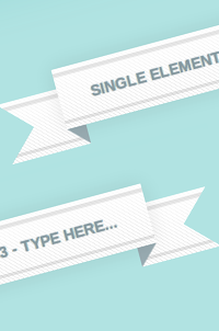
Single Element Pure CSS3 Double Fold Ribbon

View code Play Walkthrough

Description

Ribbons are an extremely popular design element.

This is a simple experiment to create a 3D double fold ribbon using just one HTML element.

The ribbon design is made using 4 CSS3 gradients combined together and the complex folds of the ribbon is emulated using a clever combination of pseudo elements, box shadow and borders.

You can edit the text of the ribbon which will change its width as well as the width of the ribbon ends because of its flexiblity.

This demo works with all major browsers.

Design by Premium Pixels.

Add New Comment

8 Comments

(close)
andrej

andrej

this is madness!!!

seriously craziest and most interesting css I have seen in years. Impressive :)

One uprade probably would be transparency though. Just on a sidenote ;)

ebhoren

ebhoren

Wow, killer technique.
Really impressive.
Transparency should make this trick the best way to build ribbon.

Imran Malik

Imran Malik

Stunning… This simply show how powerful CSS3 is. Hope to see some other COOL stuff using CSS3 only.

Ralph

Ralph

Nice one… never thought it would be possible with one element, but of course with gradients we can ‘draw’ stuff too.

Chris

Chris

Awesome. But I find myself wondering how to ever use any of these cool effects in a content-management-system based site, like Drupal, where you have so little control over markup.

Thanks!

Andrew Kenny

Andrew Kenny

Great technique. I was actually looking for a pure CSS ribbon a few days ago and just came across this completely by accident. Too late for this web project but will add it to the toolbox.

nobody

nobody

Awesome
Great technique
Thanks

 
<!-- Lets make a cool single element ribbon -->
<h1 contenteditable>Single Element - Pure CSS3 - Type here...</h1>
 
<!-- PrefixFree to deal with vendor prefixes -->
<script src="http://thecodeplayer.com/uploads/js/prefixfree-1.0.7.js" type="text/javascript"></script>
<!-- You can download it from http://leaverou.github.com/prefixfree/ 
The demo still stays pure CSS3 :) You can manually write CSS for all browsers too.
-->
 
/*Basic reset*/
* {margin: 0; padding: 0;}
 
html, body {height: 100%;}
 
body {
    background: #B1E3E2;
    box-shadow: inset 0 0 100px 20px #80D0CF;
    text-align: center;
}
 
h1 {
    display: inline-block;
    font-size: 14px;
    line-height: 28px;
    color: #8699A0;
    text-shadow: 0 0 1px #758890;
    margin: 120px 0;
    font-family: arial, verdana;
    outline: none;
    padding: 14px 30px;
    position: relative;
    text-transform: uppercase;
    /*A little shadow for 3d effect*/
    /*Finally another shadow to negate some aspects of the :after element to complete the effect. This drops a shrinked shadow over the :after element with the same color like that of the background. The shadow is shrinked by the same offset amount = 18. And it is moved down by twice the offset amount to cover the entire height of the :after element*/
    box-shadow: 
        0 0 30px 0 rgba(0, 0, 0, 0.1), 
        0 36px 0 -18px #B1E3E2;
}
 
/*The ribbon ends*/
h1:before {
    content: '';
    position: absolute;
    top: 18px;
    left: -15%;
    z-index: -1;
    width: 130%;
    /*We will be using the triangle logic - 2 sided borders and 0 height. That will create negative triangles on the left and right*/
    height: 0;
    border: 28px solid rgba(0, 0, 0, 0);
    border-left: 28px solid #B1E3E2;
    border-right: 28px solid #B1E3E2;
    /*Same color as the container which is the body in this case*/
}
 
/*The after pseudo element will negatve the bottom part of the ribbon completing the effect*/
h1:after {
    content: '';
    width: 100%;
    height: 0;
    position: absolute;
    top: 100%; left: 0;
    z-index: -1;
    /*The height of the top border is same as width of the left/right borders for the smoothest effect. The height of the top border is also the same as the offset the :before element has from the top*/
    border-top: 18px solid #99acb2;
    border-left: 18px solid transparent;
    border-right: 18px solid transparent;
}
 
h1, h1:before {
    /*Some cool multi-background - we will use a combination of 4 backgrounds to create a cool effect*/
    background-image: 
        /*2 grey borders*/
        linear-gradient(
            transparent 8%, 
            rgba(0, 0, 0, 0.1) 8%, 
            rgba(0, 0, 0, 0.1) 14%, 
            transparent 14%, 
            transparent 86%, 
            rgba(0, 0, 0, 0.1) 86%, 
            rgba(0, 0, 0, 0.1) 92%, 
            transparent 92%
        ), 
        /*white gloss gradient*/
        linear-gradient(
            rgba(255, 255, 255, 0.75), 
            rgba(255, 255, 255, 0) 
        ), 
        /*thin stripes*/
        linear-gradient(
            45deg, 
            transparent 40%, 
            rgba(0, 0, 0, 0.1) 40%, 
            rgba(0, 0, 0, 0.1) 60%, 
            transparent 60%
        ), 
        /*white base*/
        linear-gradient(white, white); 
    background-size: 
        cover, /*borders*/
        cover, /*white gloss*/
        4px 4px, /*thin stripes*/
        cover; /*base white*/
}
 
h1, h1:before, h1:after {
    box-sizing: border-box;
    /*Fix to make the borders appear on the ribbon ends also*/
    background-origin: border-box;
}

5x 10x 15x 20x

8 Comments

Description