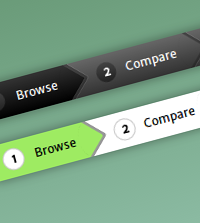
Pure CSS3 breadcrumb navigation - the pixel perfect way
Description
The problem with most CSS3 based breadcrumbs is that they use border based triangles for the arrows which is awful because:
1. Hover effects are not pixel perfect - hovering on the arrows creates issues because they appear to be triangles but occupy a square region. So hovering/clicking at the edge of a link could trigger the event on the next/previous link actually.
2. You cannot use gradients on borders which means you are stuck with flat colored breadcrumb links.
3. You cannot animate the links along with the arrows using CSS3 transitions.
The solution is to use rotated squares lying half inside the link and half outside giving a triangular shape - not just in appearance but also in functionality.
But positioning rotated squares is a tedious task because the dimensions are all out of control. Hence we apply some math to scale down the rotated squares to occupy the same height as the links so that positioning them becomes easy.(More explanation on this in the code/walkthrough).
This tutorial also uses CSS Counters to number the breadcrumb links. The first breadcrumb displays the use of gradients for the links whereas the second demo uses flat colors along with transitioned hover effects for the navigation.
19 Comments
Description


19 Comments
(close)D. Reed
Just an FYI. You misspelled ‘awful’ as ‘aweful’ in your introductory paragraph.
I thought you’d want know to know. Otherwise, great tutorial.
RickD
Bitchin’. When people ask me what I do for a living, or at least part of it, I should just send them this link. Mind you, my skills are not quite at this level.
D Carr
I agree with Rick! That was a very impressive demo.Thanks!
David
THX a million for your very useful and beautyful tutorials, ruby_on_rails!! Simply lovin’ it!!
Benedict Forrest
Genius! Amazing job and thanks for sharing.
Hate to be a bummer… but it seems that Safari still isn’t supporting transitions on pseudo elements. So in your second example I’m seeing the rounded, rotated square change colour instantly and the rest play catch-up.
You didn’t make a claim on cross-browser perfection or anything so it might not matter but I thought I’d just let you know what I saw just in case!
Niels Matthijs
Cool, but this has nothing to do with breadcrumbs of course. Call it wizard nav, step indicator or whatever, but a breadcrumb is an entirely different component.
Nice css pointers though.
keshav
Awesome work !!!
Thanks for sharing.
hungltmed
awesome! thanks :D
chhana
Thanks,it helps me alot. can i download those videos.
ANIL KUMAR
HI. It is simple awesome. One small suggestion is It is not working in Internet Explorer.
krish
How to implement same breadcrumbs for the html structure like this?
right now I am using a big image for the breadcrumb for the wrapper class. I want to change it with this example I have three steps
peters
My friend do you know how to make your breacrumb compatible with this requirements:
https://support.google.com/webmasters/answer/185417?hl=en
?
Martin
This walkthrough is awesome. I’ve never thought it’s that simply. Thank you :)
amit kumar karn
Really helpful.
Great work .
Jos
Thanks for your nice breadcrumb!!
suresh
Hi, Can you help in retaining the tabs position on page reload.
Darko
Cool. And impressive.
Fanuel
Great walk-through, Thank you. Could you please help me bind this to the different sections so that it is updated when I click next. Thank you
Martin Müller
Thank you for this clean, simple and beautiful code. We have based our cart-breadcrumb on your CSS-code, you can see the result in our web shop “http://www.badendruckt.de/cart_first.htm” (you have to select and add a product to the cart)
Thanks again,
Martin