Pure CSS Text Bubbles

View code Play Walkthrough

Description

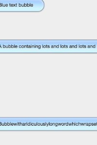
This walkthrough features code that creates iOS inspired text bubbled made from pure CSS and HTML.

0 Comments

(close)
 
<div class="containter">
    <div class="bubble">
        Blue text bubble
    </div>
    <div class="bubble bubble--alt">
        Green text bubble
    </div>
    <div class="bubble">
        A bubble containing lots and lots and lots and lots of content on multiple lines
    </div>
    <div class="bubble bubble--alt">
        Bubble with image
        <img src="http://lorempixel.com/100/100/" alt="" />
    </div>
    <div class="bubble">
        Bubblewitharidiculouslylongwordwhichwrapsefforlesslyontotwolines
    </div>
</div>
 
body{
    background-color: #eee;
    color: #222;
    font: 0.8125em/1.5 'Helvetica Neue', Helvetica, Arial, sans-serif;
}
img{
    display: block;
    height: auto;
    max-width: 100%;
}
.container{
    padding: 40px 20px;
    margin: 0 auto;
    width: 400px;
}
.bubble{
    background-image: linear-gradient(bottom, rgb(210, 244, 254) 25%, rgb(149, 194, 253) 100%);
    background-image: -o-inear-gradient(bottom, rgb(210,244,254) 25%, rgb(149,194,253) 100%);
    background-image: -moz-inear-gradient(bottom, rgb(210,244,254) 25%, rgb(149,194,253) 100%);
    background-image: -webkit-inear-gradient(bottom, rgb(210,244,254) 25%, rgb(149,194,253) 100%);
    background-image: -ms-inear-gradient(bottom, rgb(210,244,254) 25%, rgb(149,194,253) 100%);
    background-image: -webkit-gradient(linear, left bottom, left top, color-stop(0.25, rgb(210, 244, 254)), color-stop(1, rgb(149, 194, 253)));
    border: solid 1px rgba(0, 0, 0, 0.5);
    border-radius: 20px;
    box-shadow: inset 0 5px 5px rgba(255, 255, 255, 0.4), 0 1px 3px rgba(0, 0, 0, 0.2);
    box-sizing: border-box;
    clear: both;
    float: left;
    margin-bottom: 20px;
    padding: 8px 30px;
    position: relative;
    text-shadow: 0 1px 1px rgba(255, 255, 255, 0.7);
    width: auto;
    max-width: 100%;
    word-wrap: break-word;
}
.bubble:before, .bubble:after{
    border-radius: 20px / 10px;
    content: '';
    display: block;
    position: absolute;
}
.bubble:before{
    border: 10px solid transparent;
    border-bottom-color: rgba(0, 0, 0, 0.5);
    bottom: 0;
    left: -7px;
    z-index: -2;
}
.bubble: after{
    border: 8px solid transparent;
    border-bottom-color: #d2f4fe;
    bottom: 1px;
    left: -5px;
}
.bubble--alt{
    background-image: linear-gradient(bottom, rgb(172, 228, 75) 25%, rgb(122, 205, 71) 100%);
    background-image: -o-linear-gradient(bottom, rgb(172,228,75) 25%, rgb(122,205,71) 100%);
    background-image: -moz-linear-gradient(bottom, rgb(172,228,75) 25%, rgb(122,205,71) 100%);
    background-image: -webkit-linear-gradient(bottom, rgb(172,228,75) 25%, rgb(122,205,71) 100%);
    background-image: -ms-linear-gradient(bottom, rgb(172,228,75) 25%, rgb(122,205,71) 100%);
    background-image: -webkit-gradient(
        linear, left bottom, left top, color-stop(0.25, rgb(172, 228, 75)), color-stop(1, rgb(122, 205, 71))
    );
    float: right;
}
.bubble--alt:before{
    border-bottom-color: rgba(0, 0, 0, 0.5);
    border-radius: 20px / 10px;
    left: auto;
    right: -7px;
}
.bubble--alt:after{
    border-bottom-color: #ace44b;
    border-radius: 20px / 10px;
    left: auto;
    right: -5px;
}

5x 10x 15x 20x

Comment

Description